
The emphatic image
Rethinking presentation strategies

When getting the news on a cellphone a viewer generally sees a list of articles, each often illustrated with a small image meant to be emblematic — an image the size of a postage stamp of an explosion indicating a war, trees on fire indicating an environmental apocalypse, a police car indicating a crime, and so on.
The list of articles serves as a menu — click on one or the other, it’s your choice. Other than the top-to-bottom hierarchy, there’s little indication of which issue or event should be the reader’s focal point. And the meme-like imagery does little to engage either with the events being depicted or with the reader.
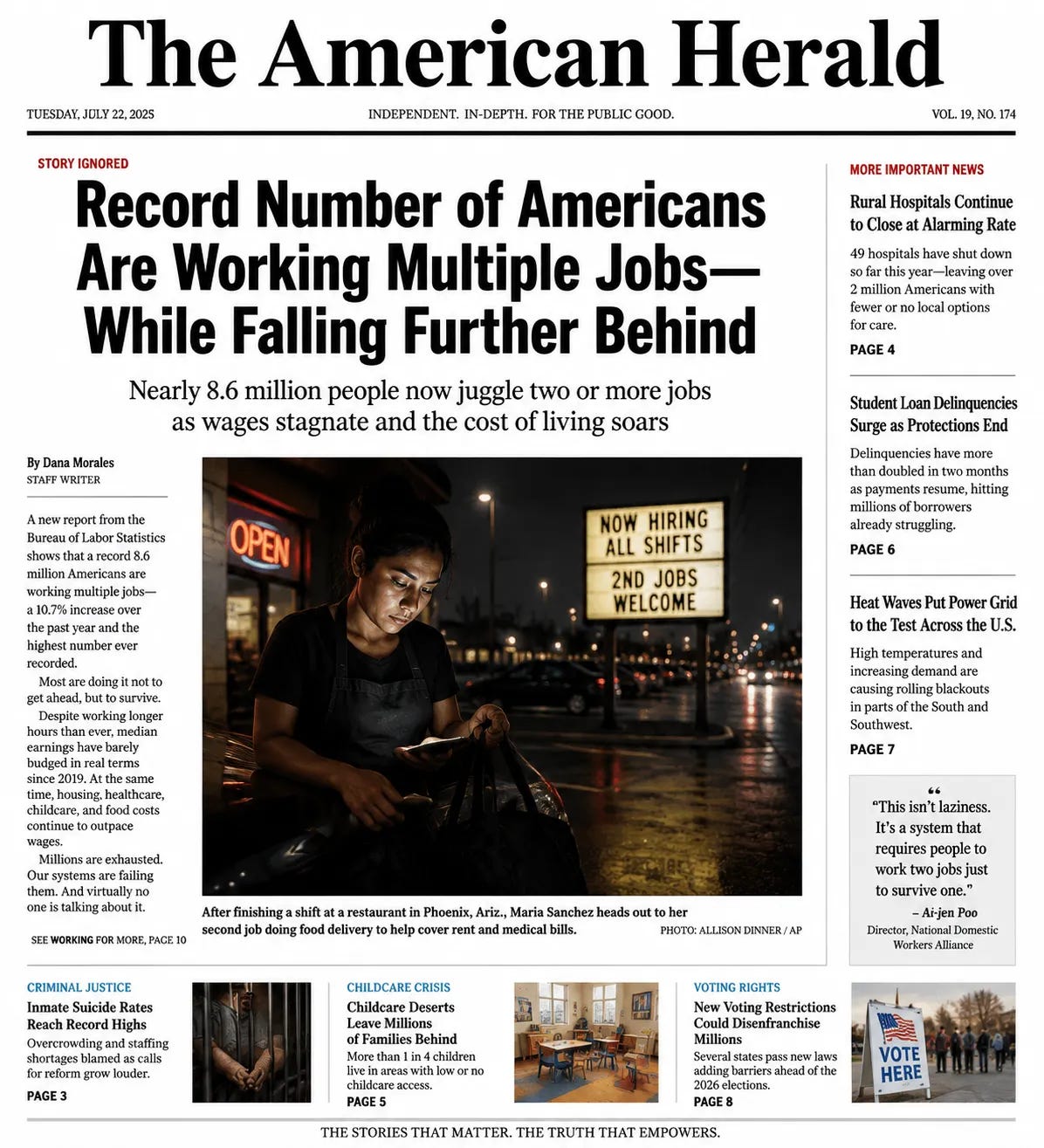
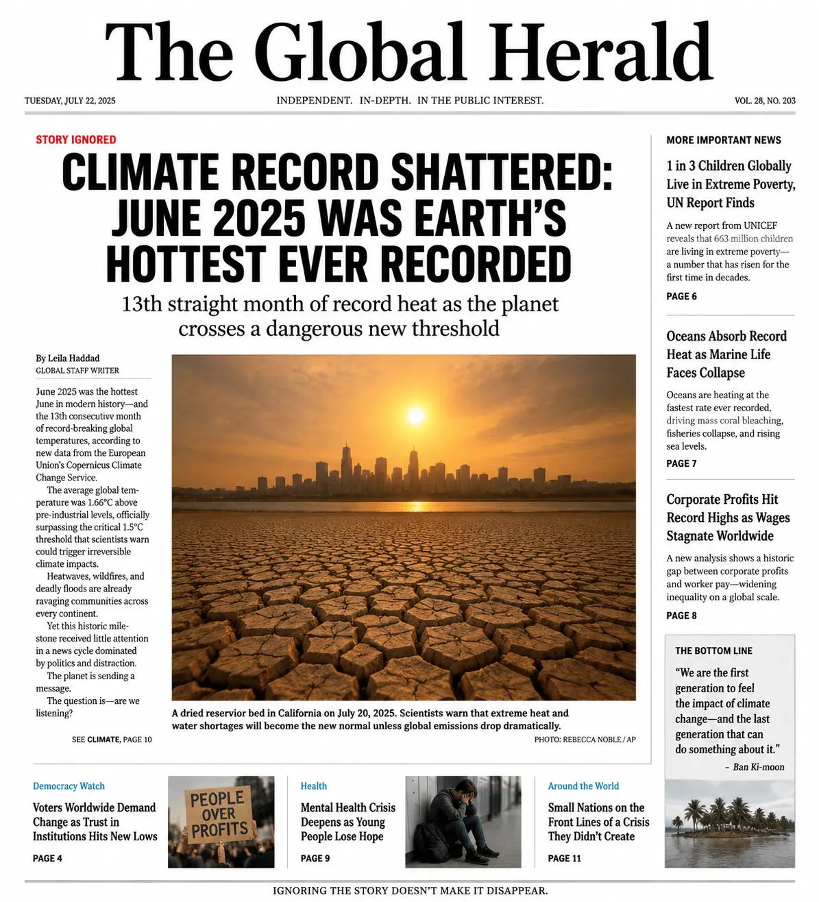
So I asked AI to decide what should be the issue that is the central highlight of that day’s news, and to select, or generate, as in the first three examples below (it erroneously added photo credits), the image for what, even in a digital environment, I was still calling the front page. In the examples below, the AI also wrote all the headlines and subheads, and even named the journals — I am simply passing them on in the spirit of experimentation.
Even on a cellphone, these examples should make it more possible for a viewer to engage more viscerally with that day’s news than by scrolling down a list, while still able to click on the other articles for more context or to read about different subjects. The AI also suggested to me that it would be a good idea to explain to the reader why, in the spirit of transparency, each image had been selected for the front page, and then at the end of the year to group all 365 of them as a de facto annual of world issues and events.
Here the consumer is not given a set of choices to peruse but an emphatic sense of what the editors thought to be most important. It is not a list, but am emphatic statement designed to engage the readers’ attention without them being overwhelmed by a panoply of choices, and to encourage a slowing down and a focus.
And, as an aside, in the various experiments I attempted, an image of Donald Trump did not appear on a single AI-generated front page.


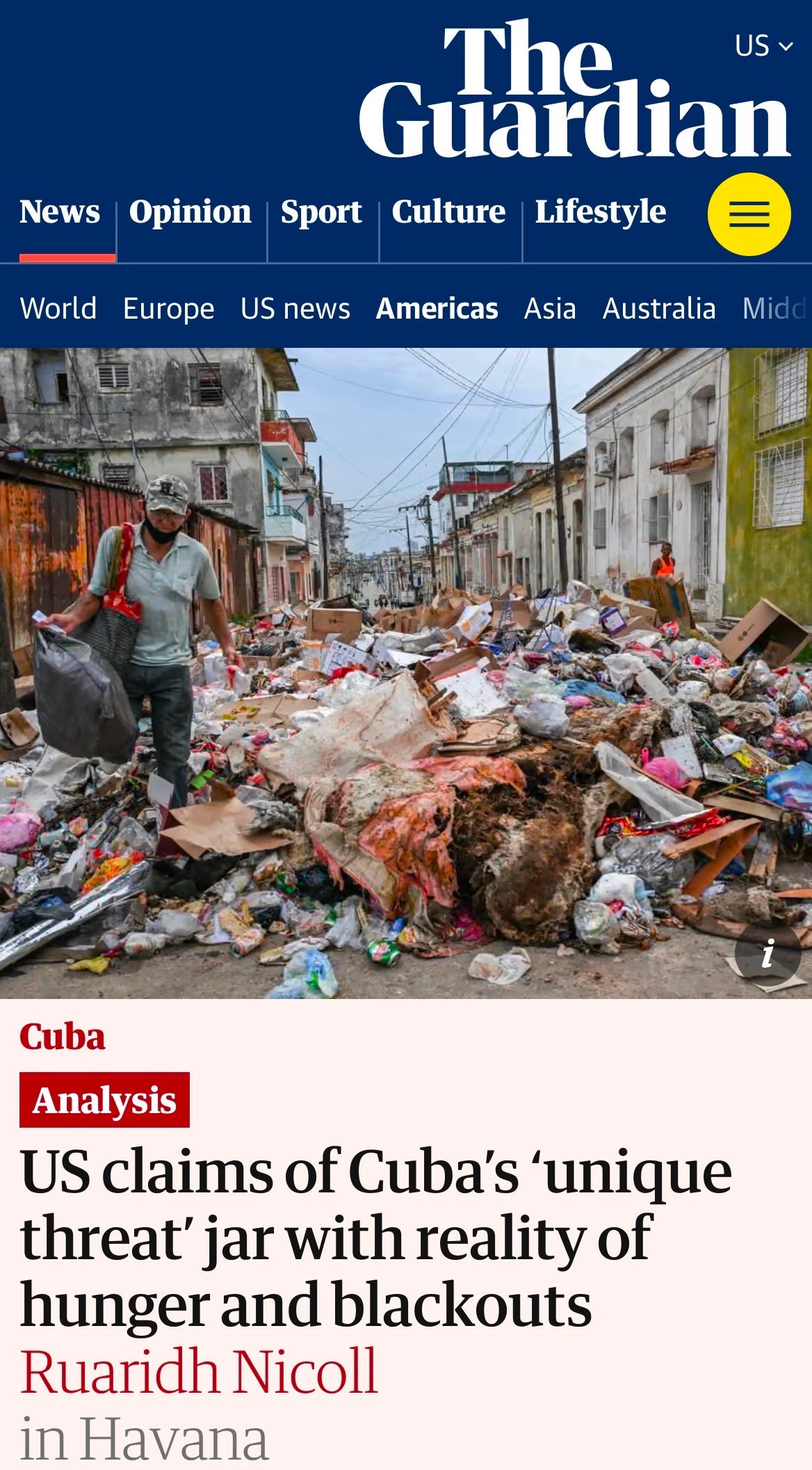
In the example above, I provided the photograph from a Guardian piece (below) to see what the AI would do. To my mind, its presentation is more empathetic to the people of Havana, shunning a US-based geopolitical perspective.
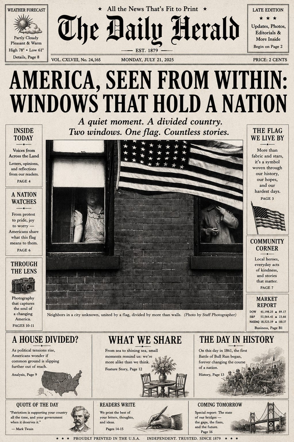
This is another example where I provided the photograph. I find the AI’s analysis of what the image depicts today as quite extraordinary, pertinent as well to the 1950s when the photograph was made (“A quiet moment. A divided country. Two windows. One flag. Countless stories.”). Leaving out Robert Frank’s name as its author is, however, a considerable error.
Given that the national elections in the United States are fast approaching, with other countries such as France soon facing their own, it might be a good moment to reconsider how presentation strategies, including the use of imagery, might help publications to better engage with readers. One photograph, seriously supported and contextualized, might well be worth more than a thousand images.
Fascinating that the first three depict a "news" that is decidedly bad all over the world, while the final example using the Robert Frank image depicts an idyllic America from a bygone era. There's a quaint positivity about it all - referencing symbols, stories and a communal focus - countering the "divided country" headline and Frank's image. I'd have expected the AI to present something far more negative. It's as though the flag is triggering the model.
This reads like blind faith. Are editors and readers so incompetent that we need AI "to decide what should be the issue that is the central highlight of that day’s news"? Given that AI engines are not identical and serve different corporate masters, do we really want AI to "explain to the reader why, in the spirit of transparency" we should pay attention to whatever it's feeding us? Will AI edit the Times better than its editors? Surely no one would believe that, thanks to AI, "the consumer is not given a set of choices to peruse but an emphatic sense of what the editors thought to be most important," unless the AI engine eavesdropped on their meetings, monitored their email, and/or scraped their archives. Why would we want AI to limit the free flow of ideas, to "engage the readers’ attention without them being overwhelmed by a panoply of choices"? This is not journalism, it's marketing. Publishing an iconic image by Robert Frank with attribution to "Staff Photographer" is not a "considerable error." It's theft.
You are absolutely correct to assert that it's time "to reconsider how presentation strategies, including the use of imagery, might help publications to better engage with readers." Unfortunately, AI will continue to be deployed to confound and obfuscate as it propagates disinformation.